
This is a tale of two halves.
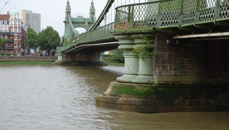
It begins around the turn of the 20th century, with the establishment of a new private printing press near the banks of the Thames, and comes to a dramatic close in the winter of 1916, under cover of darkness, on Hammersmith Bridge.
The second half begins just over a century later, under a similar premise: to start a private press, but veers off on a typographic tangent spanning four years, before coming to a climax under that same bridge in Hammersmith, in the autumn of 2014.
ACT I; Scene 1: The Doves Press
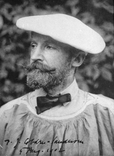 Thomas James Cobden-Sanderson was a Cambridge-educated Englishman with a philosophical conviction that the secret to a happy life lay in attaining harmony with the beauty and order of the universe. The way to achieve this, he believed, was a return to hand-made things, an elevation of the ‘lesser arts’, and the beautification of everyday objects. It was a philosophy that would manifest itself in a rejection of the ornate tastes and aesthetics of the time, in favour of a new simplicity and purity.
In the 1870s, Cobden-Sanderson was working as a lawyer, but he dreamed of something more meaningful, more manual. At a dinner with William Morris, who had recently started his own printing company, Kelmscott Press, Morris’ wife Janey suggested Cobden-Sanderson take up book binding. And so he did, setting up his own bindery in 1893. It was his first creative endeavour and considered very influential in the new Arts and Crafts movement, which Cobden-Sanderson himself had christened in 1888.
But his ambitions grew, and in 1898 he declared: “I must, before I die, create ‘the book beautiful’, and actualize it – paper, ink, writing, printing, ornament, and binding.”
In 1900 Cobden-Sanderson invited Emery Walker, a photo-engraver and expert on type and printing techniques (who acted as unofficial adviser to Morris at Kelmscott), to partner with him in the creation of a new private press.
The Press was called Doves, after a nearby river-side pub of the same name.
ACT I; Scene 2: The Book Beautiful
The Doves Press took a fresh approach to the printed page. Eschewing the overly-decorative borders and flourishes of fashionable Medievalist and Art Nouveau styles, Cobden-Sanderson and Walker elevated the type to being the focus of the page.
To achieve this, they created their own signature font.
Walker used the uppercase characters from a Venetian type by Nicholas Jensen, and the lowercase characters from a type by Jacobus Rubeus, both from 1476, as a basis for redrawing what would become known as the Doves Type. The punches and matrices were cut by Edward Prince in 16pt.
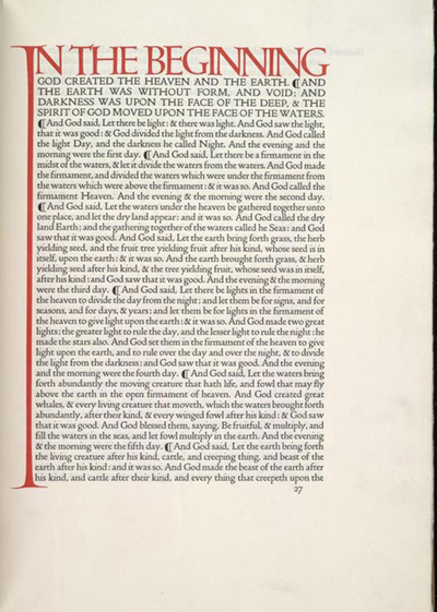 At the time of its debut, Doves Type was described in terms akin to a racehorse: “trimmed to a slim grace, with no ounce of superfluous flesh, but full of spring and life.”
Doves Press admirer and expert Robert Green, agrees: “The Doves Press adhered to a form-follows-function aesthetic. Cobden-Sanderson believed that his type was the art, whereas to William Morris type was an element. Doves pages were stripped of decorative borders and illustration. Elegant, clear and legible type — sometimes sporadically adorned by Edward Johnston’s monumental calligraphy — acted alone in drawing the reader into the text.”
Doves published approximately 50 books between 1901 and 1916, the most famous of which was its version of the King James Bible; all 500 copies were bought in advance. But despite critical acclaim, the Doves Press was never really a commercial success. Walker stepped away from the day to day running of the business after less than a decade of operation, and a legal agreement was drawn up in which Cobden-Sanderson had use of the type until his death, at which time it would pass to Walker.
But Cobden-Sanderson couldn’t bear the thought of his type being used by anyone else, and in any manner beyond his control. In a “Consecratio” at the back of the Doves’ 1916 ‘Catalogue Raisonne’, and then more explicitly in letters to Walker’s lawyers, Cobden-Sanderson revealed that he had “irretrievably committed the Doves type to the bed of the River Thames”.
ACT I; Scene 3: The River Bed Bequeath
The punches and matrices were the first things to go, during the week before Good Friday, 1913.
Then, following the completion of the Doves’ final publication in 1916, Cobden-Sanderson began making almost nightly trips to Hammersmith Bridge, throwing bundles of his beloved type into the Thames.
Despite his advanced age and ailing health, Cobden-Sanderson systematically dumped more than a ton of metal – in over 100 individual parcels – into the murky depths of London’s famous river, between August 1916 and January 1917.
In Consecratio, which was a kind of last will and testament, he wrote of his ritual sacrifice: “To the Bed of the River Thames on whose banks I have printed all my books, I bequeath the Doves Press Fount of Type – the punches, the matrices, and the type in use at the time of my death, and may the river in its tides and flow pass over them to and from the great sea for ever and for ever, or until its tides and flow for ever cease; then may they share the fate of all the world, and pass from change to change for ever upon the Tides of Time, untouched of other use, and all else.”
Thomas James Cobden-Sanderson died in 1922; Emery Walker followed in 1933.
ACT II; Scene 1: The Dream
Graphic designer Robert Green worked in the antiquarian book trade before studying at St Martins and completing a Masters at the Royal College of Art in the 1990s.
Fast forward to 2010, and Green was considering starting a private press. “I wanted to publish what in essence were going to be copyright-free texts. The first one was going to be Voltaire,” he says.
But first, “I thought I should have a signature typeface, so I started doing various tests with typefaces and looking around for something good to use. That’s when I stumbled on the type of Doves Press, which I remember having seen in college. “
Green assumed there would already be a digital version of the Doves Type out there, “because pretty much everything has been digitised”, but couldn’t find one.
“So, being someone that does custom typefaces, I thought that I would redraw it myself,” he says. “And then the mission to redraw the typeface overtook the original project of publishing.”
ACT II; Scene 2: The Digitisation
Green’s initial Doves Type reference was a facsimile page from a book about William Morris, but it was “blown out” and not a very good representation. Nor were any of the images he was able to find online. Eventually he did discover a digital version of Doves Type, created in the 1990s, but it wasn’t for sale, and also, “I didn’t think the guy had done a great job. It looked like he’d just auto-traced it”.
“So I went on a mission to find proper references. I went to the British Library, but for various reasons I wasn’t allowed to photocopy or photograph things large enough to get a decent image. So I phoned up someone (I knew from my antiquarian bookshop days) and said ‘have you got any Doves books?’ they said: ‘no, but so and so has’, and I said ‘how much am I looking at?’ and he said ‘you can pick up cheap stuff if you’re lucky’, so I had to wait until something cheap came up, which was this,” Green says, presenting some Doves Press “printers’ overs”.
“From there I did 100s and 100s of scans, scanned it over and over again. But I realised I didn’t have the whole alphabet. Also, what’s called the ‘colour’ of the type was too light, because it’s a printer’s proof. It doesn’t have the punch, the weight. “
Despite not being completely happy with what he produced, Green released his digital Doves Type in 2013.
“It wasn’t heavy enough, so I decided to add a bit more weight, a bit more body to it,” he explains. “And by that time, I’d read so much on the Doves Press that I thought I knew where it was, and as I’d gone this far with it, I might as well go and find it.”
ACT II; Scene 3: The Discovery
“We’re in 2014 now,” Green begins, “and I’d been working on the Doves Type for four years. Obviously I’d been doing stuff in between to earn money, but mainly I’d been working on the type.
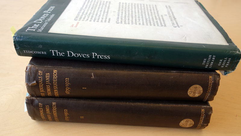
“I had Cobden-Sanderson’s journals, and a book on the Doves Press by Marianne Tidcombe, and between the two of them, it basically says where the type is, so I went down there and I looked and I found it.”
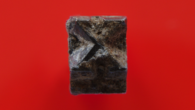
As outrageous and unlikely as it sounds, it literally was that simple. Green explains that, after obtaining a mudlark’s licence, “I got the tables for low tides, and I just went down there at the lowest tide possible and within about 20 minutes I found three pieces pretty much exactly where I thought it was going to be; which was about 15 yards from where Cobden-Sanderson would have thrown it.”
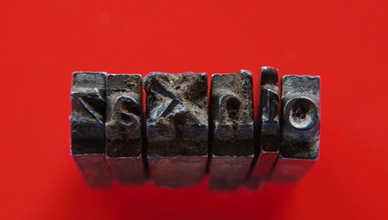
Green proudly shows the text message he sent that day in October 2014 – a picture of him holding the letters v, e, and i, with the words ‘look what I found’.
“I thought I’d find some, but I didn’t tell anybody I thought I’d find some because I didn’t want to put the kybosh on it,” he says.
“Under the bridge there’s a lot of masonry and detritus from the original bridge that was knocked down to build this new bridge over it, so the riverbed is actually quite solid there. Where it was thrown, the tide kind of rips around the skirt of the bridge, and because lead’s dense, it goes as far to the bottom as it possibly can. I looked as far as I could underneath all the rocks and detritus and I found three pieces, as well as some type furniture, right at the bottom of that stuff.
“I was pretty sure that the rest of it was down there somewhere if I’d found three pieces.”
Green called in the Port of London Authority to help recover the rest, and in total, found over 150 pieces of the original Doves Type. It wasn’t a complete alphabet, and some of the characters had broken faces, but it was the most accurate source material from which to start digital Doves Type version 2.
“It was pretty amazing. Half of me felt amazed that I’d managed to find it, and the other half felt vindicated that I knew it was there.”
Epilogue
Green’s updated digitised facsimile of the Doves Type was released in 2015 in OpenType OTF and web formats. While being as true to the original as possible, the kerning and tracking have been slightly adjusted, and some concessions to modern requirements made in the form of dollar and euro currency symbols. He reflects now: “It had never been digitised properly and somebody sooner or later was going to do it, so why not me? And I like a challenge; I don’t do things by half measures.”
But, he says, what has struck him most about this endeavour is how the importance of the Doves Press has been lost to history.
“Cobden-Sanderson was a complete maverick, but he’s been forgotten. By the time I was reading books in college, they weren’t going into detail about how influential he was, just that Doves was a historic type. This is what I found interesting about it. In the curriculum you jump from William Morris and Art Nouveau to the Bauhaus. But you’re missing the break in between. Modern type did not start with the Bauhaus.
“The Doves Press is at a fulcrum in type and book design. Breaking with the Victorian habit of amplifying past forms, it was the very beginning of modernism; 20 years before the Bauhaus. What Cobden-Sanderson thought to do was take original types and modernise them, and that’s been the attitude to type revivals ever since.”
Green has taken the Doves Press spirit of modernisation a step further – “this is a modern revival of a historic typeface, which was a modern revival of another typeface itself. It’s very meta” – but digitisation is where he draws the line.
“I’d like to see some books, some great literary works printed in it. That would probably anger Cobden-Sanderson more than anything, but my digital type is not his typeface, it’s a different thing.
“(Mine) is a disembodied image of the forms cut by Edward Prince – the typeface – not Cobden-Sanderson’s system of 16pt metal type, which is a physical object with physical constraints. I have had to adjust my type slightly to make up for the fact that there is less ink spread in litho printing and none on digital screens. The impression of metal type has ink spread that differs from character to character, page to page, making each imprint of each element unique. That’s the beauty of letterpress. You can’t reproduce that digitally.
“I was asked by someone to make a metal type of it, but I said no. Then you’re really sticking two fingers up to Cobden-Sanderson.
“Of course – did he throw it away to keep it from the world or from Walker? That’s debatable.”